“It is naturally selected by power (Power) rather than overtaking with Force (Force).” David R. Hawkins (1927—2012/American psychiatrist and writer. It advocates a map of consciousness (Map of Consciousness) and is known for its unique evaluation method using muscle reflex tests (kinesiology))“Power or Force?”If you translate it into a sales page (LP) design, this is all it takes. Here, I will throw away difficult logic and gently explain where and how to fix the LP to change from “imposition” to “spontaneous acceptance” in words that quickly fit into the reader's body. Along the way, I will share what I experienced in the field as a marketer.
1. Why does this way of thinking work for LPs
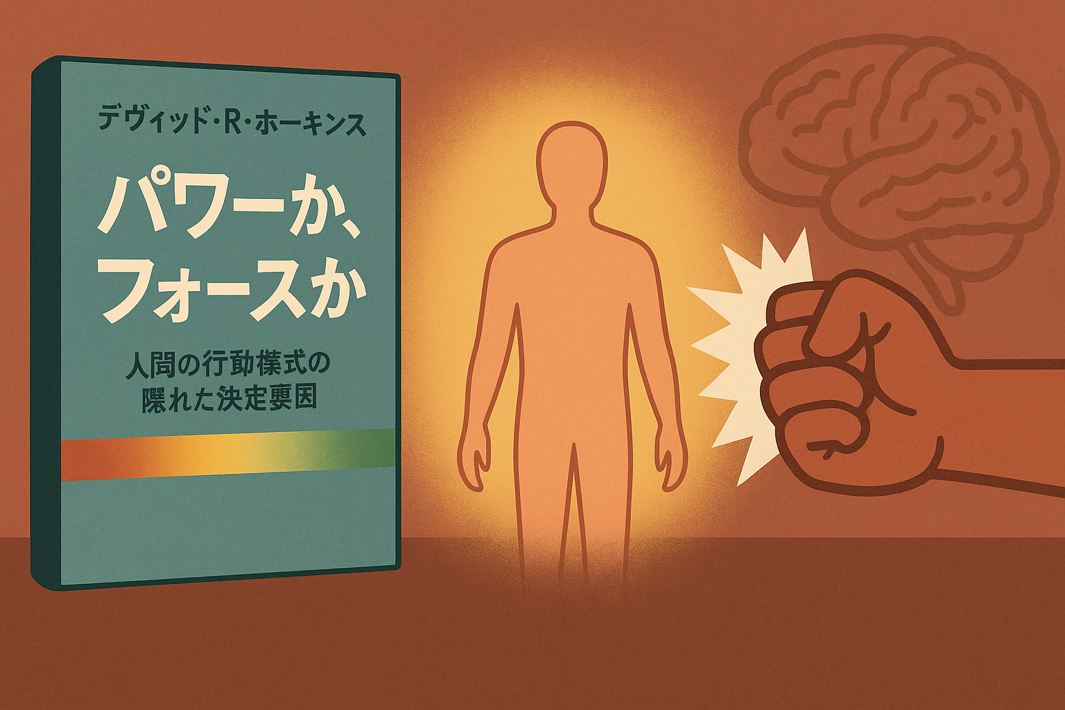
On Hawkins maps, consciousness rises and falls on a scale of 1 to 1000. With 200 “courage” as a boundary, the bottom is force (the world where fear, anger, shame, etc.), and the top is power (the world where acceptance, love, joy, etc. come from). When this framework is applied to LPs, the appeal of “hasting/inciting with fear, and making smaller by comparison” is almost a force, and the appeal of “offering materials that can be selected with satisfaction, respecting and leading, and showing long-term benefits” is powerful. Even if Force can move clicks in the short term, it is easy to leave behind withdrawal or distrust. Power may seem plain at first glance, but it works with reading rates, stays, referrals, and LTV. The design changes if you remember that LP is not an instantaneous power competition, but an endurance run supported by the core.
2. Chosen by power rather than selling with Force
Force is a force that pushes from the outside. “Move” with strong headlines, strong countdowns, and strong warnings. Power is the power that makes you want to move from within. The transparency of information, the safety of relationships, and the specificity of the future “make me want to move.” Even with the same product, the former “you will lose money if you don't buy it now,” and the latter “I can understand why this is useful to you.” Do you place your hand on the reader's shoulder and push it, or hold out a map next to them? The LP's role is the latter.
3. First View starts with “reassurance+purpose”
Rather than grasping with fear, the first screen lets you take a deep breath with peace of mind and then share your purpose. Specifically, place a small stamp of evidence right next to the service name or words of promise. It is “information that anticipates readers' anxiety and relieves tension,” such as evaluations from third parties, cumulative data, proof of expertise, frames for refunds and free consultations, and safety precautions. Force raises your heart rate, but power broadens your field of vision. Once your horizons expand, you'll be ready to read.
4. Body copy creates thickness in the order of “truth → fact → story”
In the main text, it flows from the power of abstraction (why it exists) to the power of examination (how it works) and the power of satisfaction (who and what changes have occurred). For example, a true declaration of “why is this service necessary in the world” is placed on the first level, and the fact “what is it, how does it work, and under what conditions is it reproducible” is placed on the second level. Finally, the story “It actually changed like this in line with that fact” is placed on the third stage. “I want to try it” grows naturally within those who read it in these three layers. If the order is reversed, it's easy to look like just a success story, and the smell of force comes out.
5. CTA is paraphrased as “invite” rather than “push”
The wording for the action button avoids imperative forms or incitement, and is written in the reader's subject. From “sign up,” we promise a sense of security and control that you can get after clicking, such as “consulting for free to relieve anxiety,” “checking if it suits you in 5 minutes,” and “deciding after listening specifically to the medical treatment policy.” Just before the button, the time required, cost, cancellation, handling of personal information, and the presence or absence of penalties are clarified in one sentence to lower the psychological “level.” CTA is not a lever that pushes your back; it's a ramp that lowers steps.
6. Drawing the line between arousing anxiety and consideration in medical and specialized fields
In fields such as health care, law, finance, etc., appealing for fear quickly goes out ethically and legally. What works here is a three-piece set called “accurate recognition of the current situation → choices → small steps you can take next.” Explanations of symptoms and issues are kept as specific as possible to “personalize” with images, illustrations, and citations, while avoiding excessive assertiveness or excessive expectations. The before and after emphasizes individuality as an experience story, and results are not generalized. Finally, prepare “safe points of contact,” such as free consultations and second opinions, and return initiative to readers. This is power design.
7. Design focuses on “quiet confidence”
Strong red, flashing, and overcrowded information create an atmosphere of force. What makes me feel powerful is the white space, clean typography, natural gaze flow layout, photo texture, and consistent tone. For example, qualification badges and published media logos are “quiet confidence” when placed so that they breathe in a size that is close to the text rather than starring Don. Readers determine whether they are “calm” or “rushed” the moment they see it. Those who calm down read more deeply.
8. Design an A/B test using the metaphor of a “muscle reflex test”
Hawkins said touching the truth strengthens muscles, and touching lies and destructiveness weakens them. In LP, this is observed with “physical response-like indicators” such as withdrawal rate, scroll rate, heat map of gaze, and form drop points. For example, if you replace it with a heading that incites fear, scrolling stops early, the rereading area increases, and withdrawal just before the form bounces off, etc., will appear in the data. Conversely, when definitions of terms are added, uneasy FAQs are brought forward, and guarantee conditions are clarified, scrolling is straightforward, and hesitation is reduced by progressive form input. A/B testing is a process of searching for a flow that strengthens readers' “inner power.”
9. My experiences (what I learned in the field as a marketer)
I have managed multiple sales pages. In a medical case, strong words such as “it will get worse if left unattended” and “take immediate countermeasures” were initially lined up, and clicks certainly increased, but the period that did not lead to the final KPI of “consultation completed” continued. When I picked up the words of people who came to consult, there were many voices saying “I was impatient and applied, but in the end my anxiety increased” and “I didn't have enough materials to decide if it suits me.” Here, I took the plunge and brought the design to power. “What can be done and what cannot be done” was clearly stated in the first view, expressions were organized in line with medical advertisement guidelines, explanations of indications, contraindications, and side effects were included with illustrations, and the purpose of the free consultation was rewritten not “to decide” but “to increase judgment materials.” Right before the CTA, we added a short summary of the time required, estimated costs, flexibility in cancellation, and handling of personal information. As a result, page reading became smoother, and the quality of consultations clearly improved. At a later date, we received a lot of feedback from people who came to consult, saying “I didn't feel like I was being rushed, and I had a sense of security that I was able to make my own decisions.” Rather than following short-term clicks, fostering readers' “ability to decide” has a positive effect on business in the long run. I clearly felt that at the scene.
1-10. A flow of small improvements that can be implemented immediately
Finally, I'll draw small steps that can be taken from today as a flow in sentences. First, let's shorten the First View declaration by one sentence, and say “who, in what state, and what principles are useful” in one sentence. Immediately after, what can and cannot be done is placed in pairs, and evidence from third parties is shown to a minimum. Definitions of terms and criteria for judgment are included at the beginning of the text, and preparations are made for readers to “choose for themselves.” In the middle, process transparency (initial consultation flow, cost structure, risks and benefits) will be shown with diagrams. At the end, I will position individual experiences as “individual impressions,” and touch on reproducibility requirements. Right before the CTA, I'll include a short FAQ to unravel anxiety one by one. The button is an “invitation” sentence instead of an “command,” and the screen is greeted with the same tone even after clicking. After publication, we will close the readers' “steps to lose strength” while watching closely and scrolling logs. This alone makes for a different LP experience.
The Force is flashy and fast, but exhausting. The power is quiet, slow, but strong. From a “tool to push” sales pages to a “place where you can decide for yourself.” If you design by trusting in the reader's inner strength, the numbers will follow later, quietly, and surely.